User Interface changes
The UI of SMARTAnnotate was changed and streamlined.
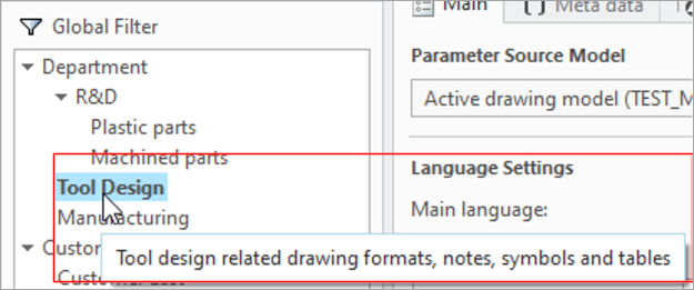
The breadcrumb and description of the Filter (Context) was removed from the UI. You can still select the context from the
navigation area and the description will become visible, if you hover over the filter name.


What is the benefit of this enhancement?
- Gaining space in the User UI and remove redundancy.
- The modification already aligns with the future look and feel of the user UI
Additional Information
|
Tips:
|
None.
|
|
Limitations:
|
No known limitations.
|
|
Does this replace existing functionality?
|
No. |
|
Configuration options associated with this functionality:
|
show_filter_description_bar is now deprecated |