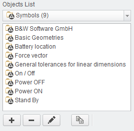
Symbols
The Symbols object contains the definition of a graphical symbol that can be used in drawing mode or 3D mode. The technical means is
a Creo Symbol.
How it works
A Symbol can be graphically selected from the dialog and is manually placed on the drawing or within the 3D model. The placement coordinates
are defined by user placement.
Adding Symbols
- Select Add new object
 or select Edit existing objects
  or use
  to copy an existing entry and modify from there.
- The Object Edit dialog appears.
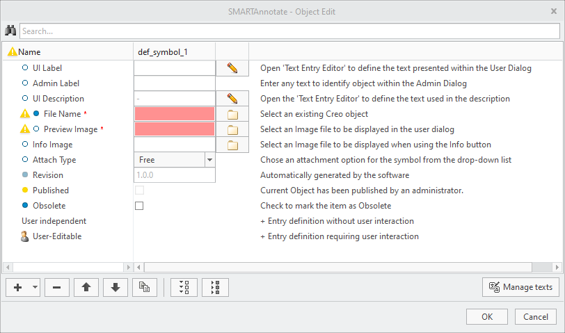
- The Object Edit dialog appears.
- Select
 to enter the UI Label that is displayed in the admin dialog.
 - (Optional) Enter an Admin Label that is used for distinction within the administration dialog.
- Select to enter the UI Description that is displayed in the user dialog.
- Select
 to choose a File Name of a symbol from the /sym folder.
 - Select to choose a Preview Image from the /images folder.This images will be displayed in the user dialog for easy user selection.
- Select to choose a Info Image from the /images folder.This image will pop up when using the Info button within the user dialog.
- Choose an Attach Type from the pull-down menu. This will define the default behaviour while placing the symbol.
- Free — Free placement with no attachment
- Leaders — Multiple attachment points with leader lines
- On Entity — will place the symbol directly onto a selected 2D item
- Offset — will place the symbol next to a selected 2D item
- The Revision will be iterated automatically every time you leave the definition dialog with OK and save the configuration. See the Versioning Objects section in the Appendix for more details-
- Check the Obsolete check box if you want to disable the symbol. It will remain within the configuration, but not anymore available for user selection.
- For a simple symbol without any user interaction select the User Independent section and choose Add new element Add Text
- A new Text entry is created within the Object Edit dialog
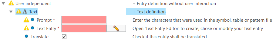
- A new Text entry is created within the Object Edit dialog
- Enter the same Prompt that was used in the symbol definition.
- Select to enter the Translation Tag representing your final text.
- (Optional) If you intend to enter an untranslated text, de-select the Translate checkbox and enter your text in the Text Entry input panel.
- For a symbol that requires user interaction (i.e. enter a value) you have three options when you select the User Editable section and choose Add new element
- Add Value — the user may enter a value for a variable text
- Choose Add new element Add Value
- A new Value entry is created within the Object Edit dialog. For every value that you want to be display in the UI you have to create a separate Value entry.
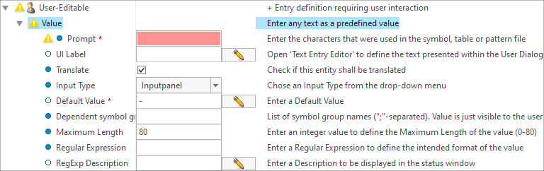
- A new Value entry is created within the Object Edit dialog. For every value that you want to be display in the UI you have to create a separate Value entry.
- Enter the same Prompt that was used in the symbol definition.
- Select to enter the UI Label that is displayed in the user dialog.
- Choose the Input Type from the pull-down menu to define how the user can edit the parameter value. You can choose from the following options:
- Read-Only — Value is displayed, but user cannot change
- Inputpanel — User can type in any value
- Optionmenu — User can select from pull-down menu only
- Optionmenu (editable) — User can select from pull-down menu or can type in a value
- Enter a Default Value in case of ‘Input panel’. Use ‘-’ for no value.
- If you have selected Optionmenu or Optionmenu (editable) from the Input Type pull-down, a first Text Item is created automatically.
- A new Item is created within the Object Edit dialog

- A new Item is created within the Object Edit dialog
- Enter a Value or select from the translated text dialog
- (Optional) Select to enter the UI Label that is displayed in the user dialog.
- Choose additional text items using Add new element Add Item
- Choose Add new element
- Group Choice — the user can select a group instance
- Choose Add new element Add Group Choice
- A new Group Choice entry is created within the Object Edit dialog.
- A new Group Choice entry is created within the Object Edit dialog.
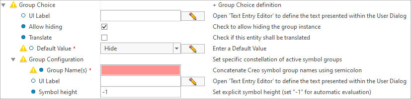
- Select to enter the UI Label that is displayed in the user dialog.
- Check the Allow hiding check box, if you want to allow this group to be hidden by the user
- Check the Translate check box, if you want the variable texts in this group to be translated.
- Select the Default group name that will be displayed in the user dialog.
- To add multiple groups select the Group Choice section and choose Add new element Add Group Configuration
- A new Configuration entry is created within the Object Edit dialog
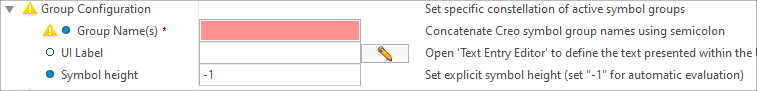
- A new Configuration entry is created within the Object Edit dialog
- Type in a Group Name that is available in the selected symbol.
- Select to enter the UI Label that is displayed in the user dialog.
- (Optional) Enter a dedicated Symbol height or keep ‘-1’ for automatic height calculation.
- Add as many Group Configuration Items as you like.
- Choose Add new element
- Group Status — the user can hide / show a group instance
- Choose Add new element Add Group Status
- A new Group Status entry is created within the Object Edit dialog.
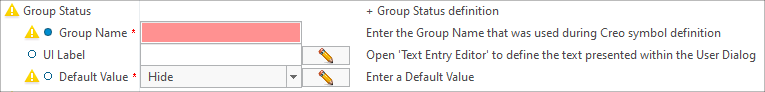
- A new Group Status entry is created within the Object Edit dialog.
- Enter a Group Name that you want to show or hide
- Select to enter the UI Label that is displayed in the user dialog.
- Select the Default status (Hide or Show)..
- Choose Add new element
- Add Value — the user may enter a value for a variable text
 Note
Note